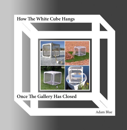
How The White Cube Hangs Once The Gallery Has Closed plays with this perspective in novel ways. A fusion of art and humor, the book follows a personified white cube as he laughs and struggles his way through one calendar year.
Click here to purchase How The White Cube Hangs Once The Gallery Has Closed.
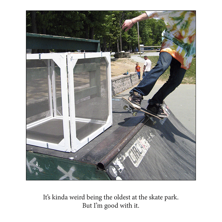
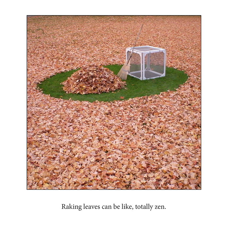
Scroll down to read the introduction and see sample illustrations.
Sample Illustrations
Introduction
Spend a day watching people walk through a museum where the galleries are hung by genre, and you’ll observe different reactions in each of the different spaces. Some viewers might pause for sculptures made centuries ago in far away lands, and those who do may comment on the fables that the sculptures reference. In a gallery featuring impressionist paintings, you’re likely to witness visitors talking about the saturated colors and gestural brush strokes in a piece. Whether or not a viewer likes classical sculpture or impressionist painting, they understand how to read them, and their relationship to art remains open and accessible. Then, observe an audience walk into a sterile-feeling, brightly lit chamber hosting a lone geometric shape, and you can watch people’s eyebrows furrow. Before they leave, you can guess what they’re thinking: Why should a white box, a neon bulb, or a checkerboard get a whole room in the museum? What makes this a masterpiece equal to the works I just saw in the other galleries?
Presenting Minimalist work as one genre among many can do more than bore an art audience: it can alienate them from visual art all together. Because logically, the next thoughts a person might have could be: if it’s important enough to be in the museum and I don’t get what I see, does everyone know something that I don’t? Does that make me dumb? And if being here makes me feel stupid, then why am I here at all—this obviously isn’t for me. Unfortunately, this unintended viewing experience is probably more common than anyone in the arts would like to admit.
The single most over-referenced quote about Minimalism is likely Frank Stella’s “What you see is what you see.” Its popularity is justified, as I’ll describe shortly. But, when this sentiment resonates wrongly, because what a person sees feels quotidian, overexposed, and distancing, that creates a problem for everyone. Because ultimately, when a museum visitor looks at a Minimalist piece, they see more than a questionable selection of institutionally empowered objects from a hardware store. They see a security guard observing them from the corner. And small groups of other people nodding sagely, with their arms crossed and a lone finger on their chin. And then they see the door.
The irony, of course, is that the founding Minimalist artists’ intent was definitely related to, but very different from, this real-world reaction. Reading Donald Judd’s Specific Objects (1964) and Robert Morris’ Notes on Sculpture (1966) provides some primary document clues about the how and why of this work. Though Judd and Morris started from different places and arrived at similar outcomes, both had the ambition to try and bring the viewer’s awareness more fully into the present moment, in both space and time. The artists hoped that by eliminating story-telling references from their work, viewers would not be conceptually transported into an imaginary world, effectively splitting them from their experience of that object in that space in that moment. The artists hoped that using industrially sourced materials would discourage the viewer from thinking about the expressive qualities implicitly found in handcrafted pieces. From their perspective, they could eliminate yet another distraction from the then and the there of that moment in time and space if the materials in their work were unaltered.
Paradoxically, in restricting the content and the form of their work for the ideational purity of a viewer’s experience of space and time, the artists increased the importance of the work’s context: the “neutral,” white, privileged space that a formal art institution can uniquely provide. And though the authority of these institutional attributes was presumed to be an absolute truth sixty years ago, these assumptions sound pretty suspect when considered today…


